Thursday, May 11, 2017

Red Hot Chili Peppers

I chose this work for this weeks blog post because of its strange components.  This is an album cover for one of my favorite bands Red Hot Chili Peppers.  I chose this because not necessarily it is a good design but very unique.  It resembles to me the time period of deconstructionism.  I say this because of the type treatment and how everything is different colors and the words are put in different areas.  There is a grunge texture placed on everything and it just looks painted on and very sloppy. no rules are being followed.  Also the colors are just off and almost disturbing.  


logo

This is a logo design made for Howard Right and it was found on communication arts online.  I chose this for the blog this week because of its simplicity and creativity.  The way that the H is implemented into the hand is very genius.  It is a very soft and nice looking logo that will definitely memorable through the design.  I have tried creating creative logos such as this and it is very hard to make the logo have the resemblance of both things.  also the cool color scheme allows for a nicer and more approachable feeling that could be beneficial for Howard Right.  If they chose a warm color, it would almost feel malicious or evil.  

simplicity

This work was found on communication arts online and is a promotion for the kent of engelwood, a beard growing company.  I chose these because i loved the simplicity through single colored backgrounds and single colored designs. I  Believe that the simplicity will allow the viewer to think more about it, because that is exactly what it made me do, and that is the purpose of designs.  The illustrations don't necessarily look like beards but they resemble them, leaving you to think more about it in your head.  

Domison

This is a piece from film domison found on Communication arts online and the artwork was done by  the design firm Paprika.  I chose this because of its simplicity and  complexity.  From afar you see it as four letters and from close up, you see the intricate designs of the staircases.  Also the color scheme leaves it to be very simple and the balanced symmetry leaves it a simple layout.  The plain white background and contrasted red on top of it makes it very pleasing to look at.  

Thursday, April 27, 2017

Global Warming

Here is an ad done to promote awareness for global warming done by Brian Maranan Pineda. This was found on Communication arts online.  This caught my eye because of how it stood out for its lack of major color and how simple it was. I clicked on it because I didn't understand it and it pulled me in which was the goal.  I love the simplicity and the symmetrical balance. It is a easily read ad without any type once you understand the purpose and it becomes very clever.  

Thursday, April 13, 2017

Illustration

This is an album cover for one of my other favorite musical artists, Andy Mineo.  Because of our focus in class and making illustrations, I chose this because I love the simple illustrations.  The illustrations inside the type make it unique and all have very good unity.  The overall image has  a lot of texture that brings the simple design to making it look like a professional design.  The negative space is also used very well in the design making it very interesting to look at.  

Thursday, March 9, 2017

Balance

This is a design piece done for my favorite musical artist, Lecrae. It is a album cover  found online at communication arts and it is for the song "fear" and you can see the story being told through the artwork. The contrast between black and white surrounding him as he looks lost adds a sense of his fear of what's right and wrong. The color scheme is very appropriate and gives the viewer a sense of dark feeling and portrays the emotions better. The composition is very asymmetrical and it is like a complex ying yang. The dark side of the face is complemented with light birds and vice verse.

Compostition

This design is a poster for the film "Book of Life" found in communication arts online.  The design is very simple but has a story that is told through it. The two skulls are put next to each other and join and make a broken heart. Having this design, the designer chose to use symmetry. The textures and colors that are used within the piece also give a sense of setting and style of the movie.

Thursday, March 2, 2017

typography

This is a design from communication arts that I loved. I was immediately pulled in by the typography and the use of design that flows out of it. All the type flows around the paper giving each word movement instead of having the type on top of the design they incorporated it. The colors inside of the type also show movement because of how it goes from one color to another through gradients. 

Thursday, February 23, 2017

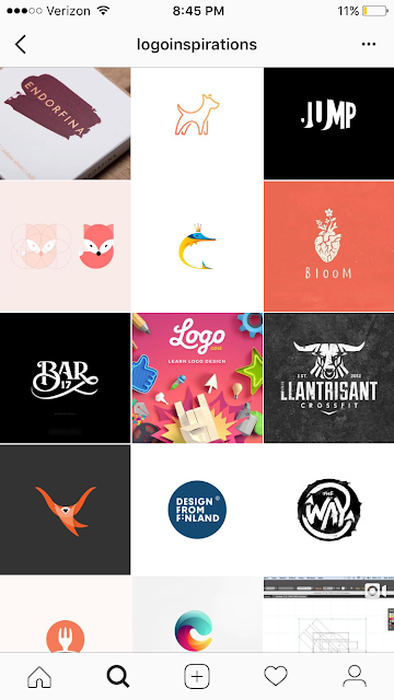
Illustration

This weeks blog is about illustration so I chose to display this Instagram page called logoinspirations. They display very modern and simplistic logos. Every piece is very inspiring and will make you want to pick up a pencil and design something. It shows you the major keys for having successful and simple designs.

Thursday, February 16, 2017

photography

This is a piece I found on the communication arts Instagram page. This is a design that describes her emotions that are associated with Los Angeles.  This piece has a very great use of photography and has such a simple and effective message that is described with it. Even the choice to use a black and white design makes it as simple as possible. It has a great use of contrast and positive and negative space along with a sense of movement from an originally still image.

Thursday, February 9, 2017

Young Graff


I found this piece on an instagram that I follow called, YoungGraff.Psd.  Although it is not from a larger and high up design I though his work is amazing.  This piece is about his skating life and his representation of his feeling for it. I loved the simplicity and super modernized design.  It is very easy to understand and can be looked at for a while which is very contemporary. I also loved the color scheme that was chosen because it works very well with the design and what the subject matter is based upon. I definitely recommend checking his other work out. 


Thursday, February 2, 2017

Legal Sea foods poster

I found this piece in the online communication arts website and this one stood out to me.  I enjoyed this one for the twist it has on it. The design itself is extremely simple but the idea behind it has a lot of meaning.  It will make everyone second guess and stop and think, which is the main goal of graphic design.  I think designs like this will be the future of design and simplicity is taking over. 

Thursday, January 26, 2017

Union Pearson Express animated film


This peice is from the Illustrator annual 2013 and I was scrolling through the different award winning designs and this one caught my eye.  It is screenshots from an animated film for an express train.  I loved the bright and cozy feeling colors with this design.  The emotion coming form this piece is exactly how they had planned to make it, which is the goal of graphic design.